From my limited experience with Pidgin users among my family and coworkers, I've discovered that a number of users don't know about Pidgin's saved status features and instead use only the transient statuses created directly in the status selector by typing a message. Some users don't even realize that they can select a previously used transient status from the middle section of the status selector's menu. As an attempt to spread deeper insight into Pidgin, I submit for your reading this saved status tutorial.
Overview of Saved Statuses
In Pidgin, a saved status gives you a considerable amount of flexibility. For example, if you use six accounts, three of which are personal and three of which are for work, you can use a saved status to have your work accounts away while your personal accounts are available and vice-versa. Or, if the text box you get from using the status selector irritates you, you can use saved statuses to get rid of it forever.
Creating a Simple Saved Status
Let's start with two basic saved statuses--one Available status and one Away status.
Click the status selector at the bottom of the buddy list window. You should see something like this:
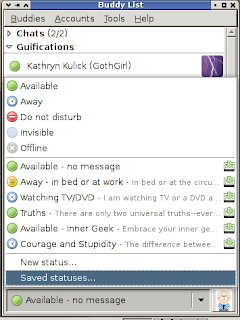
Select the "New status..." entry. You should see something similar to this:
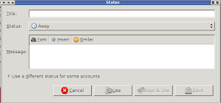
The fields here should be pretty obvious and self-explanatory. The title will be what you see in the status selector menu. Generally, I use a descriptive title, such as "Away - Sleeping" or "Available - no message," that will quickly identify the message's contents to me without needing to read the message. For this example, I'll use "Away - example."
For Status, obviously you want to choose one of the basic statuses listed--Available, Away, Invisible, Extended Away, Offline, Do Not Disturb, or Invisible. If you use only one account, your choices could be significantly different. For this example, we'll accept the default of Away.
in the Message box, type your status message. For my example Away status, I'll use the message "Away for the sake of being away."
Click Save. Alternatively, if you want to use this status now, click "Save & Use." You could also click "Use," but then the status would not be saved.
Now, repeat the process for an Available status. In this example, I'll have a title of "Available - no message", a status of Available, and a blank message.
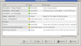
Now, if you select "Saved statuses..." from the buddy list window, you should see something like this, but probably with a lot fewer statuses listed:
Creating a Complex Saved Status
A complex saved status is where the real power of saved statuses becomes obvious. Let's modify the existing away example we created. Select it in the saved status list and click "Modify..." Now click the expander just to the side of "Use a different status for some accounts" and observe the list of accounts that appears.
Put a checkbox in one of your accounts. For this example, I'll use my pidgin.im XMPP account. Now you see a much simpler new dialog:
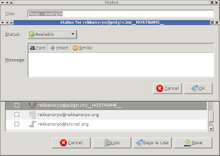
For simplicity's sake in this example, I will choose "Extended away" as the status and use "test" as my message. After clicking OK, I return to the modify status dialog, to see something similar to this:
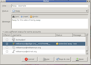
Now you can click "Save" or "Save & Use." This gives you essentially the simplest form of complex status--one in which only one account differs in status from the other accounts. Using this status will cause all but that one account to appear as away, and cause that one specific account to appear as extended away (note the clock vs. the circular sticky note).
Using a Saved Status
To use a saved status, you can select it in the status selector's menu if it's listed. If it's not listed, simply click "Saved statuses..." in the status selector to bring up the Saved Statuses dialog, then select the status you want and click "Use." The status should now be remembered in the "popular statuses" (middle) area of the status selector menu. Of course, with disuse or use of a large number of statuses, a given saved status can fall out of the saved statuses list, in which case you'll need to repeat the process of finding it again. If you use the statuses a lot, though, this won't be a problem.
Practical Applications
Saved statuses aren't for everyone, of course. They do provide a number of possible complex status combinations limited only by the number of accounts you have in Pidgin. They also let you get rid of the ugly text box for status messages for as long as you use saved statuses. They also offer a relatively quick setup time that allows you to create your status once and use it as many times as you want without ever having to think about how to configure the status again.
Enjoy playing with your newfound saved statuses!
Thursday, February 26, 2009
You Can't Please Anyone
Occasionally we make changes to Pidgin which displease some subset of our users. For an example, I'll give a brief history lesson.
We released a series of six betas leading up to our name change to Pidgin. In our first beta, 2.0.0beta1, we introduced the concept of the status selector. At this time it was a rather crude creation; it simply mashed a few widgets together to accomplish the basic tasak. When we introduced this status UI, we also introduced the concept of two ways to handle status messages. The first, and most obvious, way to handle status messages was to present a text box when selecting a basic status from the status selector in which to enter the status message. The other method was a bit more complex but significantly more powerful--this was the saved statuses feature accessible from the "Saved statuses..." entry in the status selector's menu.
When we first inroduced this UI, the behavior of the text box was to retain the status message whenever the status changed from, for example, available to away or from away to available. A number of people, myself included, were not happy with this. Eventually we changed the behavior to clear the message on status change. This displeased another group of users. Now here we are, two years later. We changed back to retaining the status message on status changes pursuant to a discussion on the development mailing list. Again, we've displeased a group of users.
The problem with this particular change is that both behaviors are valid, and fans of each behavior think their preferred behavior is the only correct behavior. Of course, now that we acknowledge that both behaviors are valid, many users' first reaction would be to say "Make it a preference!" Of course, that's a whole new argument in itself, but this is such a minor feature that it's not important enough to warrant a preference.
Note that the people who don't like the retention of the status message are inconvenienced by a single keystroke if the intended result is to clear the message, and not inconvenienced at all if the intention is to use a new message. This inconvenience, or lack thereof, is because we chose to implement the retention such that the retained message is highlighted. This means that simply hitting backspace will clear the message and typing an entirely new message will replace the message text with what you've typed.
Simply put, this change is just further proof that when you're involved in a project of any significance, you're damned if you do and damned if you don't, no matter what you do or don't.
I'm sure this post will inspire some criticism. For the time being, though, I think it's best if we ride this wave of criticism out for a bit and see if this is simply resistance to change or a genuine "problem."
Subscribe to:
Posts (Atom)